Aura
Aura is a leading Canadian interior design firm specializing in full-service design-build office transformations. As they expanded across Canada, they needed a rebrand that reflected the caliber of their work while clearly communicating the full scope of their services: strategy, design, and construction. Their internal team also sought a more flexible and robust brand system, having outgrown their limited palette and basic visual toolkit.
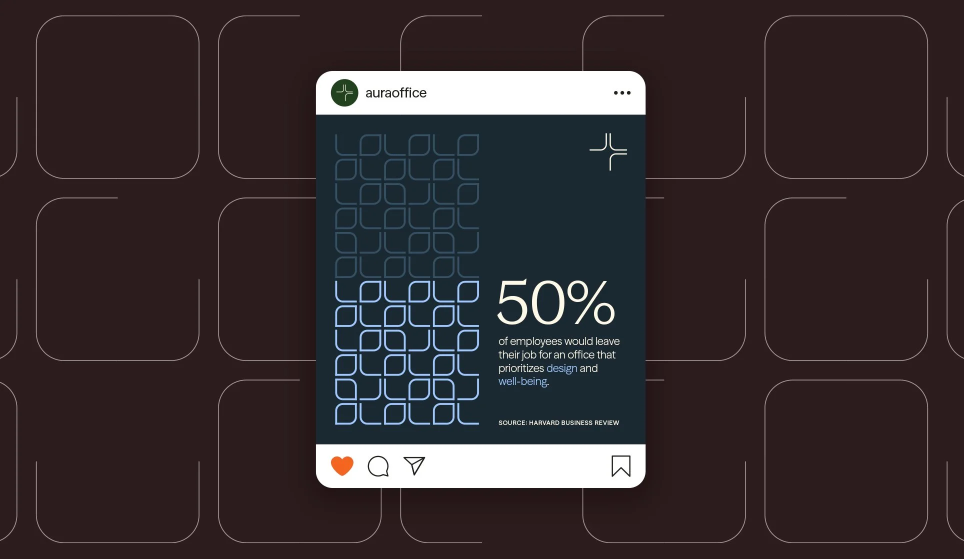
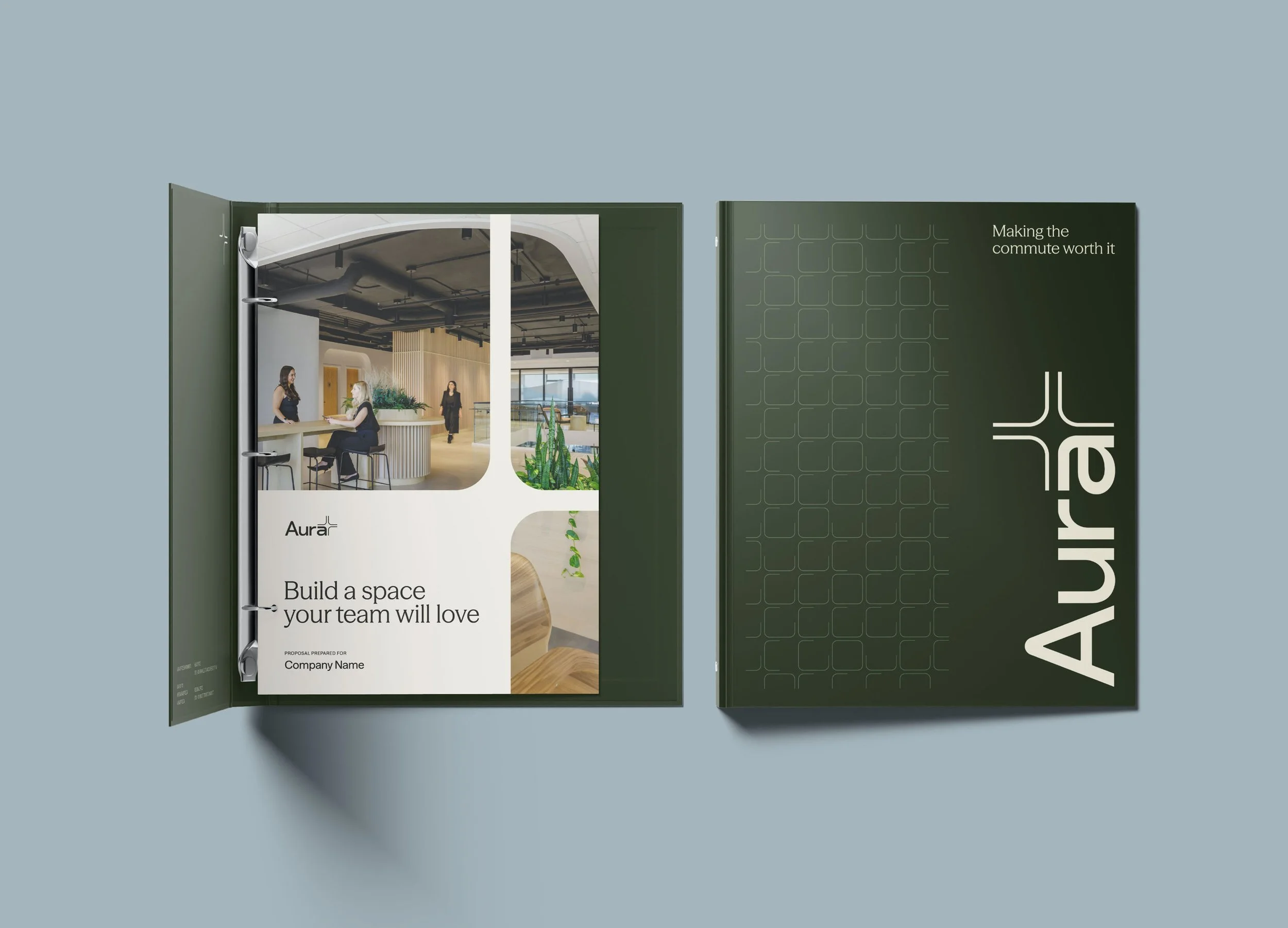
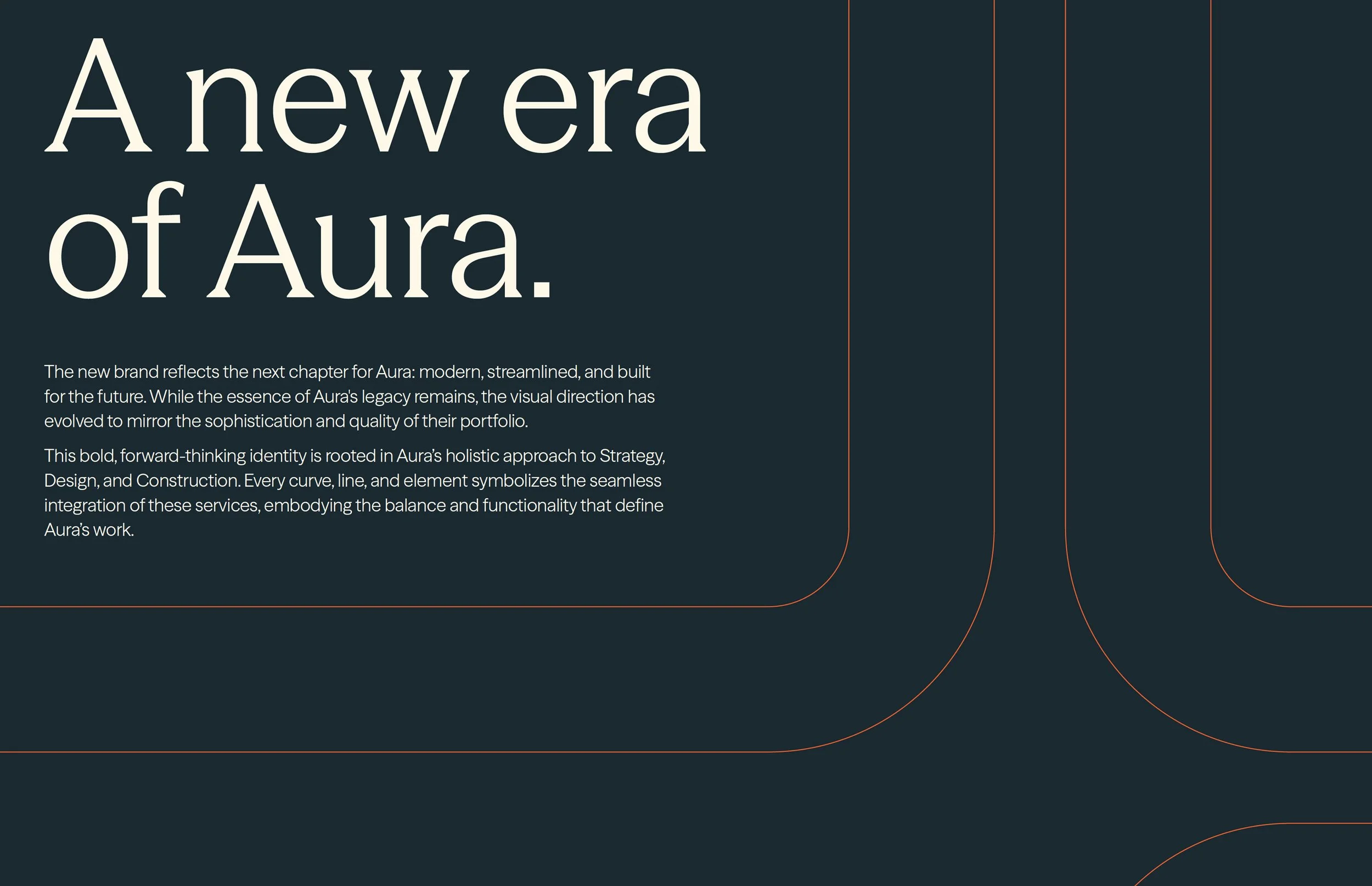
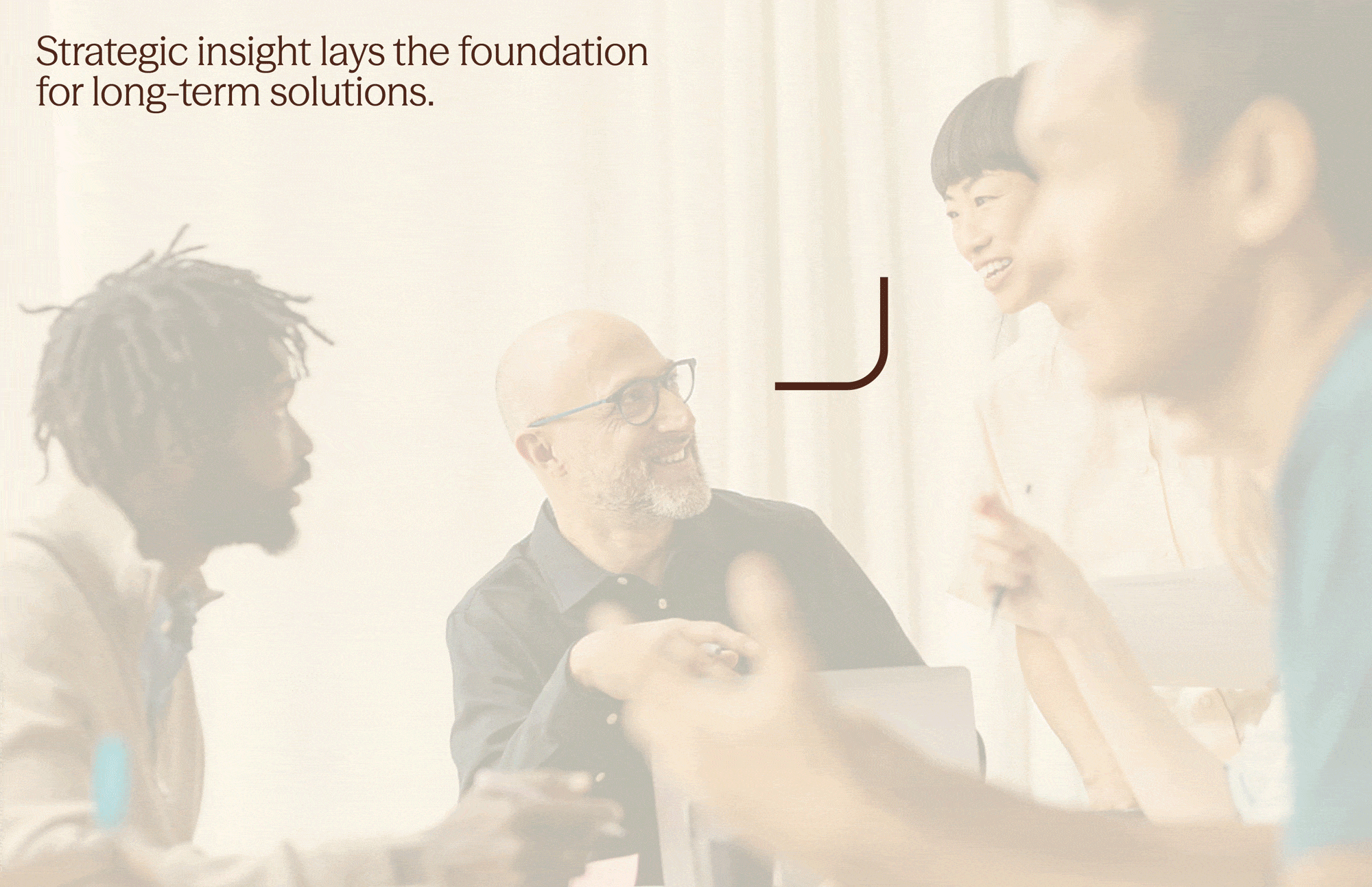
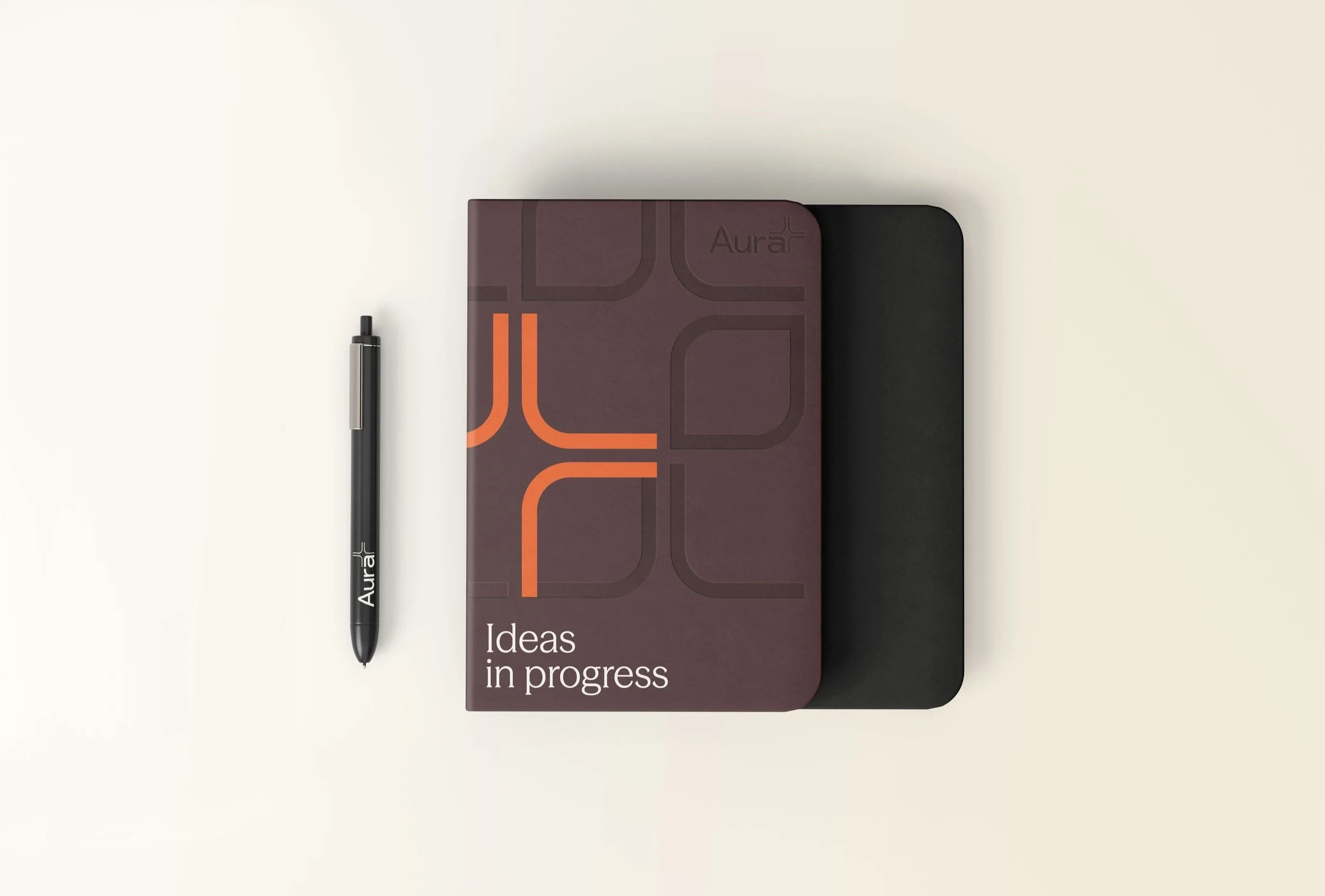
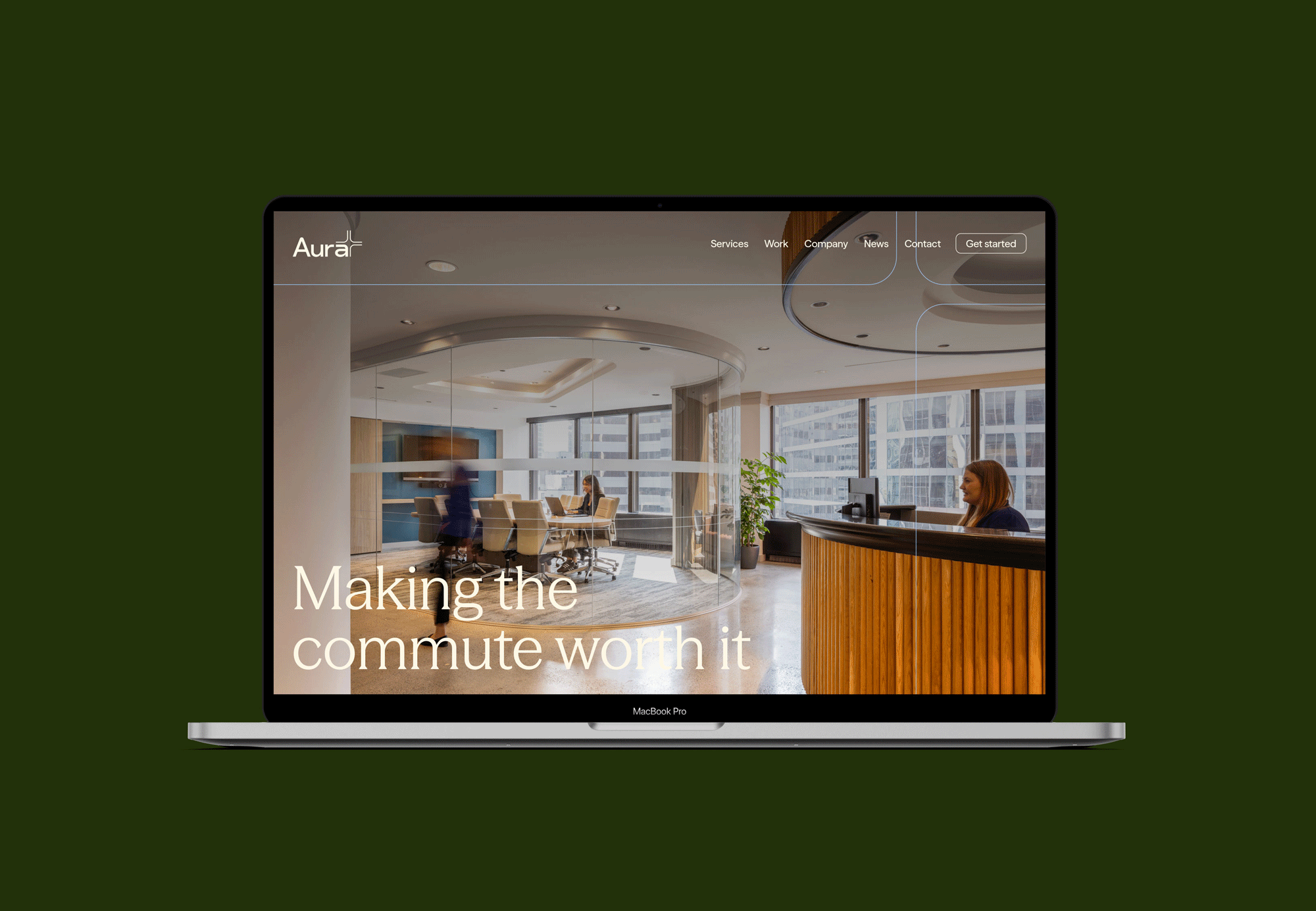
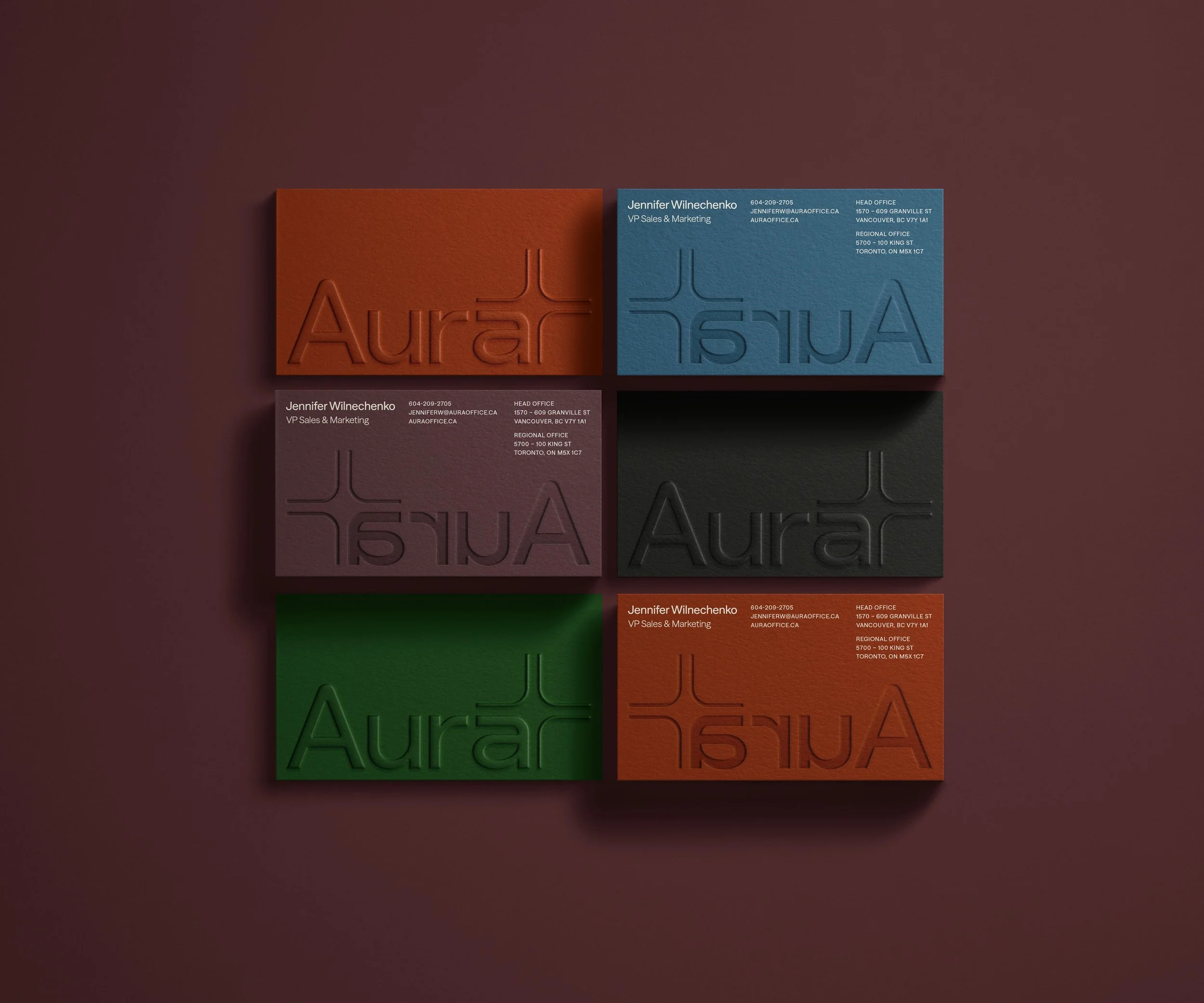
In response, I developed a refreshed brand identity that balances Aura’s people-first philosophy with the polish of their built environments. The redesigned logo modernizes their legacy mark with custom letterforms and a modular icon representing their three service pillars. The expanded visual system includes a rich, versatile color palette, patterns derived from the icon, and a set of social media templates that bring energy and adaptability to everyday use. I also designed updated business cards, letterheads, and a branded folders, ensuring Aura’s identity is cohesive, flexible, and built to scale.
The new brand system has been embraced both internally and externally, making it easier for Aura’s team to bring their identity to life across everything from event collateral to swag. The refreshed direction has received enthusiastic feedback from clients, partners, and Aura’s own team, perfectly positioning them for their continued growth across Canada.
Deliverables
Brand Identity
Copywriting
Print Design
Credits
Agency – Pivot or Die

Colour Palette & System
Aura’s colour palettes pair deep, grounded tones with vibrant accents to reflect both expertise and approachability. The rich base colours convey professionalism and legacy, while brighter highlights bring in warmth, energy, and a sense of modernity. This flexible colour system can be mixed and matched to suit a variety of moods and applications.
The combinations shown here demonstrate how the system adapts to express different facets of the brand: from professional and polished to bold and optimistic. This versatility gives the internal team the freedom to create assets that feel consistent yet dynamic across different channels and touchpoints.


Patterns & Graphic Elements
The logo icon serves as the foundation for a flexible system of shapes and patterns used throughout the brand. These graphic elements adapt easily to different contexts, acting as bold statements, subtle textures, or tools for visualizing data. Each element reinforces Aura’s identity and its focus on connection and clarity.