TenantTalks
TenantTalks is an event series by Aura Office designed to spark meaningful conversations about the future of work. With events hosted across Canada, it brings together industry professionals for thought-provoking panels, keynotes, and discussions that blend workplace insight with community connection and charitable impact. As Aura expanded its reach, the goal was to elevate TenantTalks into a recognizable and compelling brand that could stand on its own, one that felt like a bold, youthful sibling to Aura’s main identity.
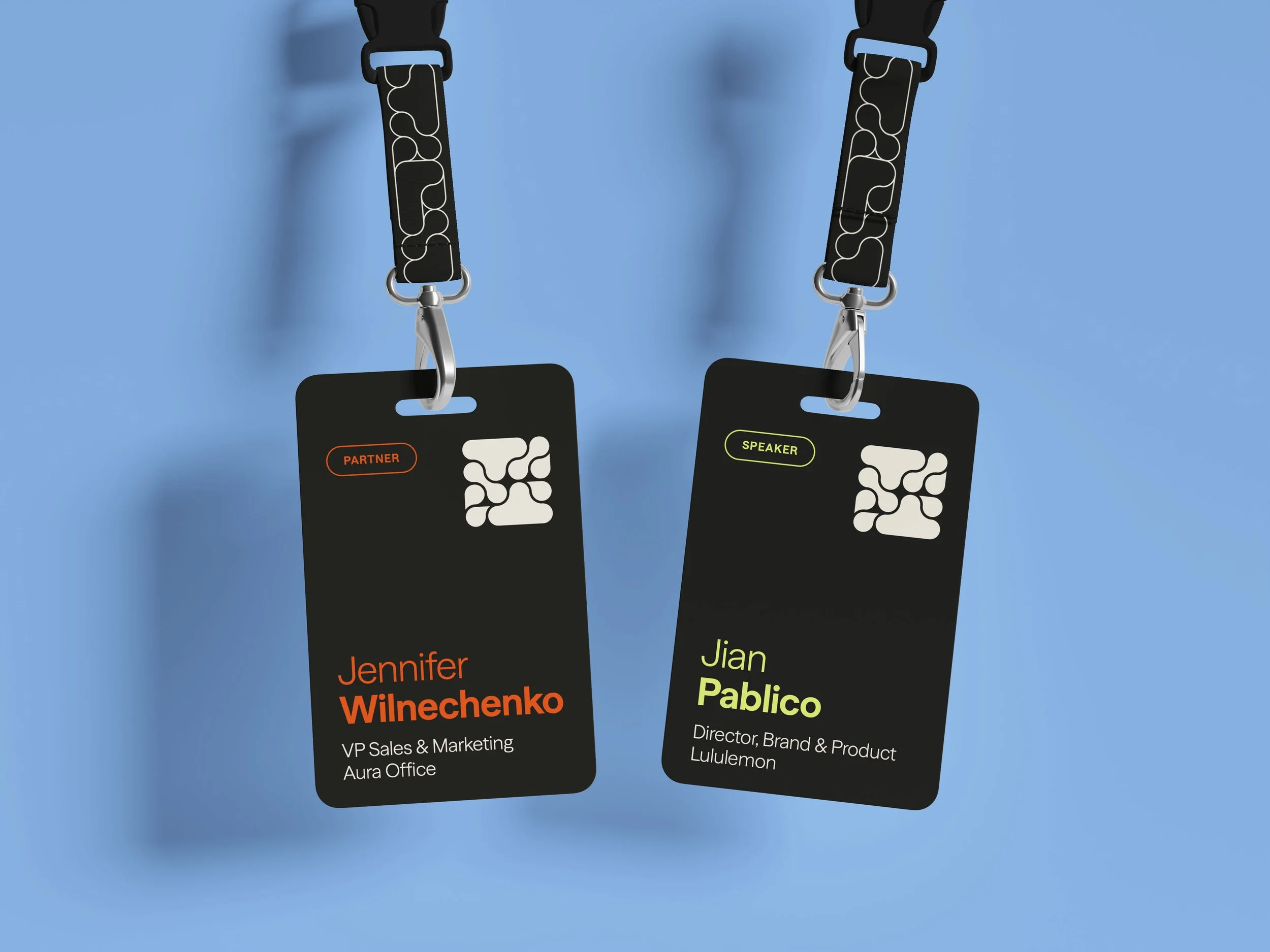
In response, I created a vibrant new visual identity that captured the spirit of collaboration and dialogue at the heart of the series. The refreshed logo, built from interwoven “T” forms and organic curves, symbolizes connection and the exchange of ideas. The brand’s dynamic look is carried through a bright, modern colour palette, expressive shapes, authentic event photography, and bold, clear typography. Along with the identity, I delivered social media templates and mockups to help visualize the brand in use and support future promotional efforts.
The new brand has been warmly embraced by Aura’s team and is ready to bring even more energy and connection to upcoming TenantTalks events.
Deliverables
Brand Identity
Copywriting
Credits
Agency – Pivot or Die

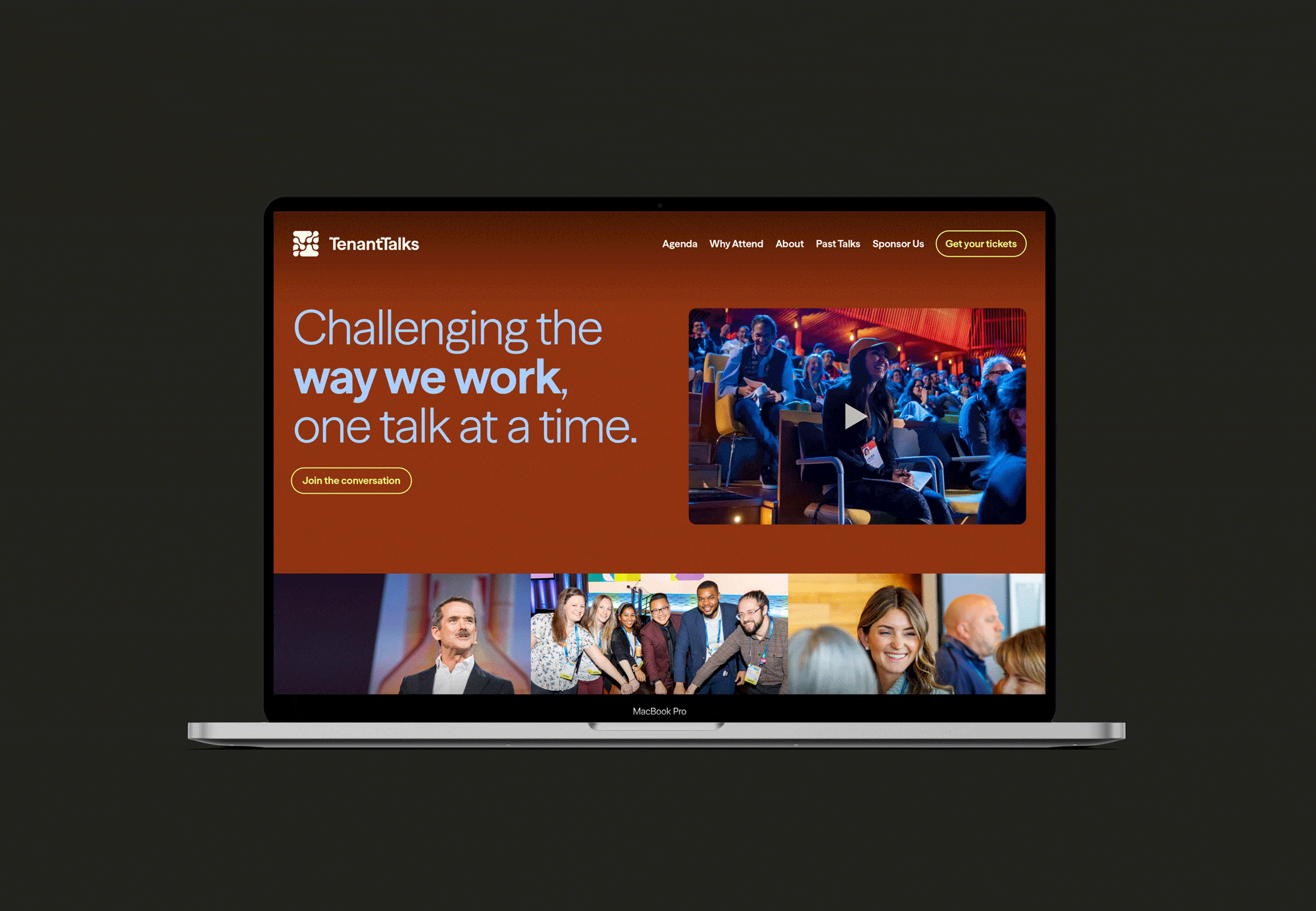
Colour with More Impact
TenantTalks reimagines Aura’s palette through a more energetic lens. Dark foundations like Onyx ground the visuals, while vibrant hues such as Flame, Citron, and Sky Blue take center stage. The result is a brand that feels punchier and energetic, perfectly suited to match the collaboration and connection at the events.

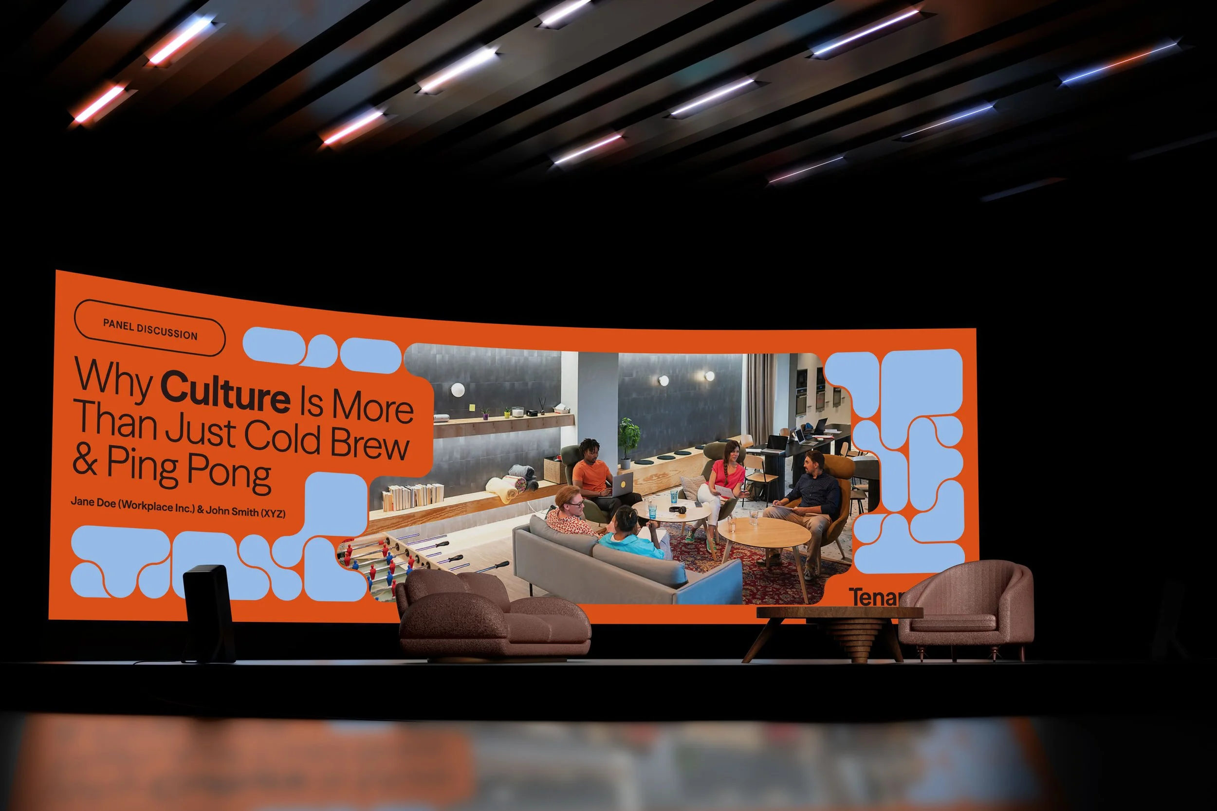
Graphics That Shape the Conversation
Built from fluid, interlocking forms, the TenantTalks graphics bring motion and personality to every touchpoint. Adapted from the logomark, these playful shapes (including an abstract “T”) reflect the spirit of open dialogue, collaboration, and shaping what’s next in workplace culture.